It’s about time I write a web layout tutorial so here it is, you’ll learn how to make this sleek layout with a carbon fiber background that would look great as a landing page for a website. Most of the techniques are quite simple; I’ll be covering things like creating and using patterns, using layer styles to match CSS properties and also a few layer masks.
Tutorial Files
If you are a PSD PRO member then download the PSD file and much more by going here.
Introduction
I felt it was about time I made a tutorial on creating a web layout, I wanted to do this a bit differently and focus on building the layout with CSS in mind; keeping everything measured and positioned and working out some of the CSS values like padding and borders. This was instead of just throwing together a layout in Photoshop that would be a nightmare to code. I could also make this a two part tutorial and make the second part about the coding of the site in HTML and CSS, I know most of you are probably here to learn Photoshop so it might not get much interest but leave a comment and say if you’d like the second part. I left this tutorial quite open in the sense that I haven’t told you everything I’ve done but told you enough so you end up with a nice layout that maybe deosn’t look exactly like mine. I haven’t gone in to details like fonts and colors so just use whatever you think looks best and I hope you get a good result.
Step 1
Create a new document with dimensions; 16x16px. First we will create the pattern used for the carbon fiber. I actually created this pattern a while ago to match the checkered pattern you see when you have a transparent background in Photoshop, so we will create that then adapt it to look more like carbon fiber. You can probably work out how to make it by looking at the image below. Basically you want four rectangle; two white then two with a color of #cecece, each 8x8px. Once you have it looking like the image below then go Edit>Define Pattern and save the pattern. You can now close this document.

Step 2
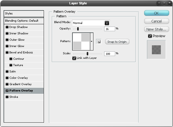
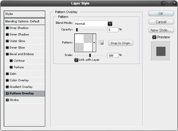
Now create a new document with dimensions; 1100x800px then create a new layer and set the foreground color to #090909. Now with this layer selected, hit Alt+Backspace and this will fill the layer. Right click on this layer then go to blending options and add a pattern overlay with these settings.
Step 3
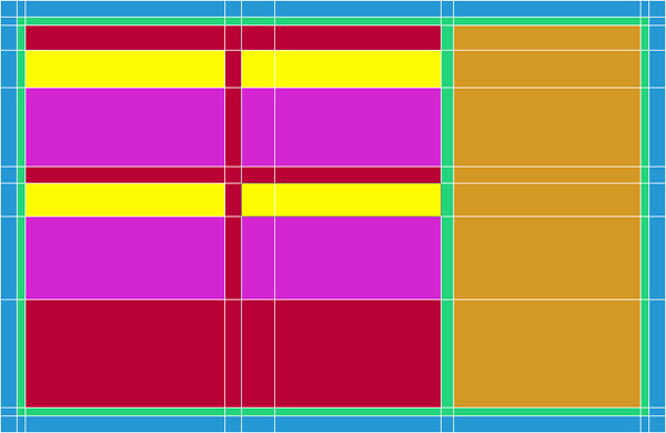
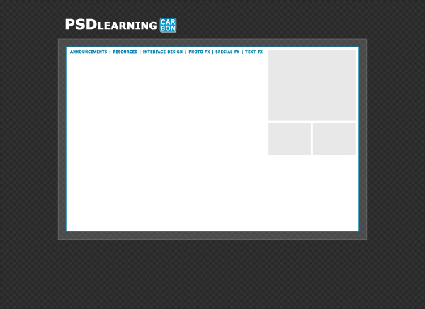
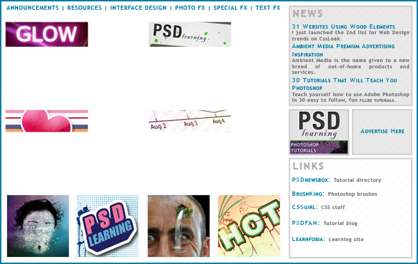
The image below shows the layout of the page (not including the background), so it showing what we will call the container, we want this to be 800x520px then we will have the header above it and the footer below. The blue part is the border of the container the green part will be the padding which is just space between the content and the border; so that none of the text or images are touching the edge. the orange box is the sidebar and the red box will contain the content of the page. The yellow boxes will be images which could be like a post preview if you were to use it as a blog or just general images that will have text below them, the text being the pink boxes. There will be other elements in the design but I only tend to accurately space out the important parts in Photoshop then add in the size and positioning of the rest when coding the site. We are going to set up guides for this which are the white lines shown here but they might be a different color for you. First hit Ctrl+R to show the rulers then hit F8 to bring up the info panel which will show you the x and y co-ordinates of your cursor. To make a guide just click on a ruler then drag into the page. If you enable snap in the view dropdown then you can hold shift to make the guides snap every 5px. Feel free to use your own values here but if this is all to confusing then go View>New Guide and just enter in the values I’ve listed below:
Vertical guides(px): 150, 170, 180, 420, 440, 680, 695, 920, 930, 950
Horizontal guides(px): 100, 120, 130, 160, 205, 300, 315, 360, 460, 590, 600, 620
Step 4
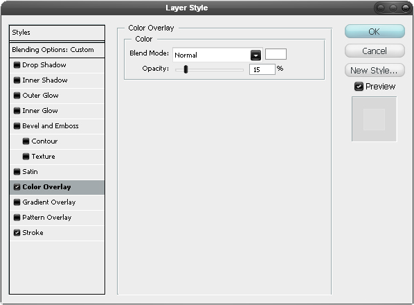
Change the foreground color to white then select the rectangle shape tool and make sure in the main toolbar that the shape layers button is pressed. Go to the View menu and check that snap is checked now draw box snapping to the outer guides, the blue box in the layout image. Next go to the blending options for this layer and add a color overlay and a stroke using the settings shown below. Lastly in the layers panel change the fill opacity to 0%.

Step 5
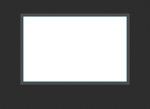
Now draw another rectangle using the next guides in; the green box in the layout image. Go to the blending options and add a stroke mimicing the settings below, you can use a different color but whatever you choose make sure you use it throughout the design so wherever I use blue use the color you decided on.

Step 6
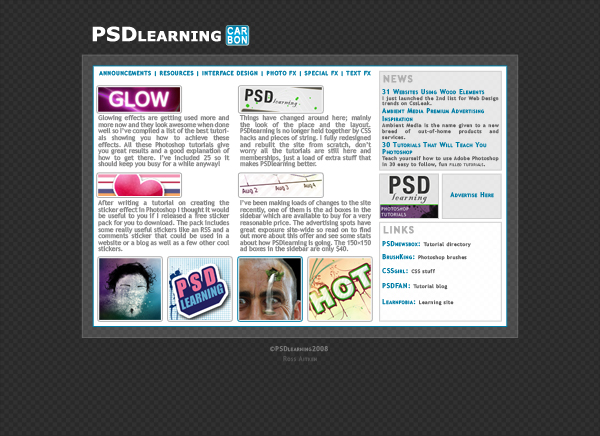
Now we are going to make a simple header, which will go just above the container, see the final image for reference. Use any font you like for this as long as it’s bold and make sure its white.

Step 7
Add the layer styles shown below to the text to get the result shown in the bottom image.


Step 8
Select the rounded rectangle tool and set the radius to 5px and draw a rounded rectangle about the same height as the text and whatever width you want. Now add the layer styles shown below, I also added some text in white.


Step 9
For the menu I just used one line of text in blue with the ‘|’ character between each category. Try and match the size and use your favorite sans-serif font for this in uppercase.

Step 10
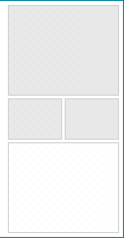
Use the guides to make the sidebar, which was in orange in our layout. The height of these boxes aren’t measured as they will depend on the content we put within them once we start coding the site so just make it rough. Use the rectangle tool for these with a light grey as the foreground color.
Step 11
Now add a pattern overlay and a stroke to these layers; the quickest way to do this is to add the styles then right click on the layer and copy the layer style then right click and paste it onto the other layers. I also added another box below which was in white that I used the same layer styles on.

Step 12
I added some content; this is an important part of designing in Photoshop as it lets you experiment with colors, fonts and sizes whereas experimenting with these kind of things is a bit trickier in CSS (unless you use firebug:)). Here I added a title to each of the boxes and filled them with some text I took from this site. I then put in an ad for my site which I had lying about. I’ll let you decide what you want to put in these boxes.

Step 13
I thought it would look good to have some thumbnail images at the bottom which could maybe link somewhere. So get some images and size them down to 100x100px and place four along the bottom, again don’t worry about the exact positioning as this is just to get an idea of the look of this part.

Step 14
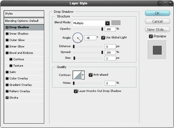
Add the following layer styles to each of the images. Note that I used a drop shadow to emulate a stroke as I really wanted two strokes. If you know any CSS then you might have worked out that the stroke will become 1px padding with a white background and the drop shadow will be a 1px border.


Step 15
We’re now going to add the images that will appear above the text, we want these to fit within the yellow boxes in the layout. First paste an image in then roughly place it where you want it. To make it so it fits within the guides that we set out then select the rectangular marquee tool and draw a box where one of the yellow boxes are in the layout image to make a selection. Now just press the layer mask button in the layers panel to add a mask to the image. There should be a chain link between the layer and the mask so click on this to remove it then select the layer and you’ll notice if you try to move it or scale it, it will still stay within this box. Repeat this with three more images. If you don’t understand layer masks much then feel free to use a different technique or just read up about layer masks in some other of my tutorials.
Step 16
Now using the text tool make some text boxes below these images then just add some text within these in a dark grey color. Also add a small footer below the container and you should have something similar to the image below.