
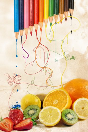
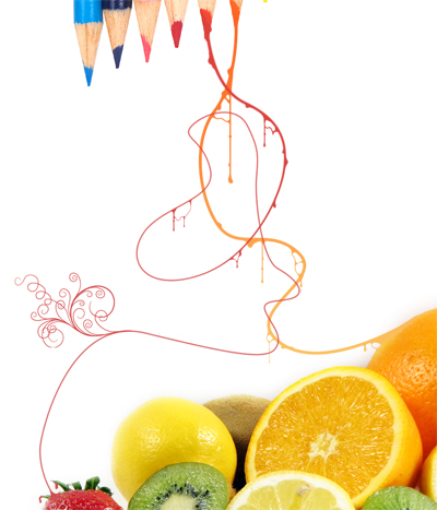
Using vibrant colors is the best way to make an image stand out, although getting the right balance is not always easy. Here we learn how to use lots of vibrant color to create a slightly abstract photo manipulation using pencils and fruit. We will learn how to use the pen tool effectively and also some freehand brushing which looks good.
Tutorial Files
If you are a PSD PRO member then download the PSD file and much more by going here.
Introduction
This is a simple and very effective style but does require some time being spent on it. Although its simple I wont be going into every detail, mainly to let you use your own creativity and also because the tutorial is aimed at people who have some basic knowledge of Photoshop already. Get some ideas in your head and lets get going!
Step 1
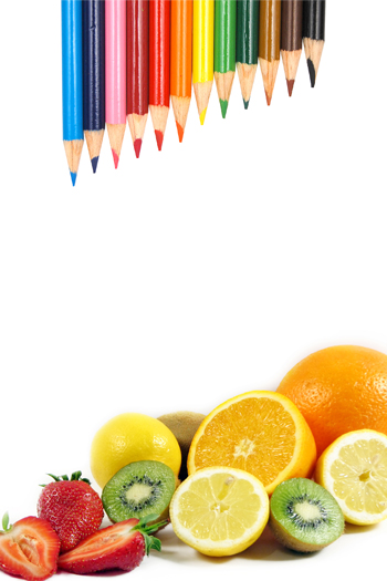
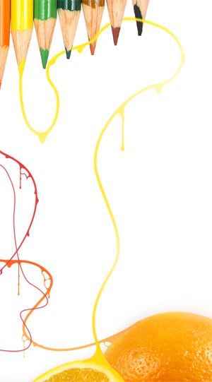
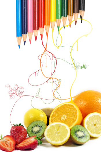
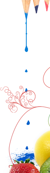
Create a new document with dimensions; 1200x1800px. Now you need to find two colorful photos or you can use the ones I did which can be found here and here. Paste both of them into your document then resize and arrange them until your image looks like the one below. If you are using your own images, they will need to have a white background or you’ll have to extract them.
Step 2
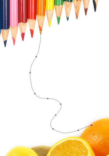
Select the pen tool then make sure in the main toolbar that paths is selected. Start at one of the pencils then create a path going to a fruit of the same color. To make the first click at the starting point then click again a bit lower down but this time hold and drag as this will smooth the curve, keep doing this until you have a path similar to the one shown below.
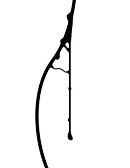
Step 3
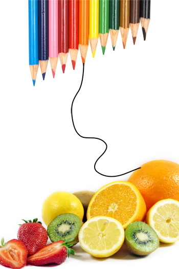
Select the brush tool (the path should still be visible) then go to the brush editor and select a 6px round brush with 100% hardness. Create a new layer then just hit return and a dialog box should pop up; select brush and uncheck simulate pressure. You should now have a black curve like shown below.
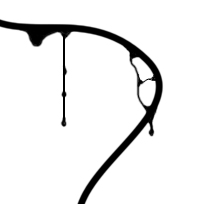
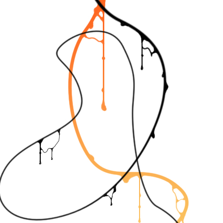
Step 4
Now we are going to add some detail to it and make it look like goo, below I’ve shown four examples of what it should look like. In each of these I first used the line tool (set at fill pixels in the main toolbar) at about 2-3px and drew a line coming from the curve. I then used a 2-3px round brush and when zoomed in I added some more detils freehand by just brushing slowly, I added drops at the bottom of each line and some beads of liquid as well. This takes time to do but looks great, the same techniques are explained in another tutorial I wrote which you can read here.
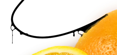
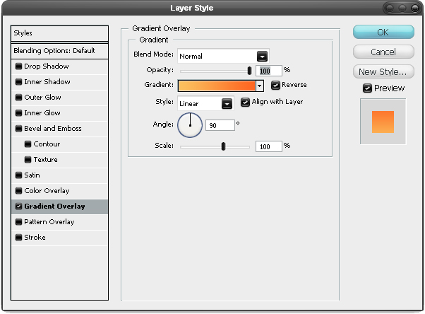
Step 5
Now right click on this layer then select blending options and add a gradient overlay. When choosing the colors for the gradient use the eyedropper to select the color from the pencil’s lead and the color from the fruit, in this case the orange. This means that the line will blend in to each of them. YOu may need to select reverse here if your gradient is the wrong way.
Step 6
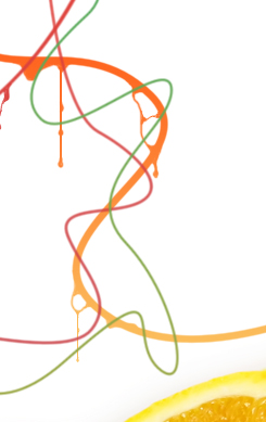
Create anew layer and do exactly the same with another color; for me I did it with red. Use the tecniques but you can try changing the size of the brush.
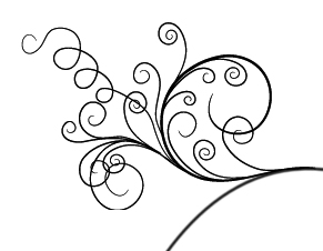
Step 7
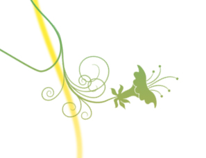
I used a floral brush to create this detail, lots of these brushes can be found here. After making the shape repeat step 5 on this layer but using red rather than orange. I’ve shown below what mine looked like at this point.
Step 8
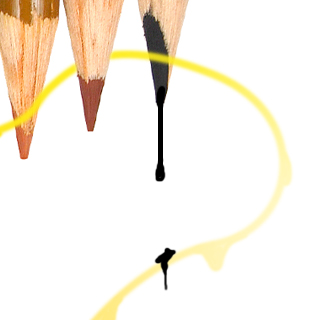
Now it’s just a case of repeating these steps with a few more colors, I’ve shown some examples in the next few steps but not gone into every detail. Here I did the same with the yellow pencil but I used a larger brush to stroke the path. I made it look like it was going behind some of the pencils by hiding part of the layer; you can do this two ways, the best would be to use a layer mask but if you’re not familiar with masks then either read a few more of my tutorials or just use the erasor tool. Again add some drips to this layer and change it to yellow to get something like the image below.
Step 9
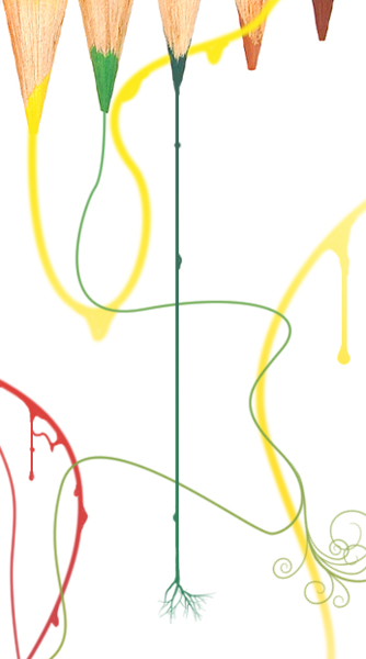
For the green one I used a smaller brush anfd made it look like it was wrapping round the other lines. I also added another floral brush as these look great.
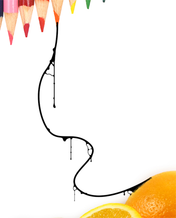
Step 10
Below I’ve shown what mine looked like at this point in the process. feel free to add more elements in to the picture, I’ve kept it quite simple here just for the sake of this tutorial but just be creative; this isn’t one of those tutorials where I teel you exactly what buttons to push so go wild and experiment.
Step 11
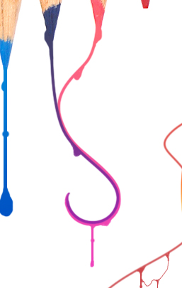
For the blue pencil, I used a line coming from the tip with a few drops on it and a splash at hte bottom created using a splatter brush. Do the same with the gradient overlay but choose a shade of blue as we are not trying to blend it to a fruit here.
Step 12
I did the black similarly but just made it look like a drip landed on the yellow line.
Step 13
For the dark green pencil I just made a line then used an upside down tree brush at the end.
Step 14
I did the purple and pink differently and they took me a while. I made two paths that followed each other but linked to the different pencils then stroked them and did the gradient overlay thing but had to edit them slightly afterwards.
Step 15
Now you’ll want to download a paper texture, there are loads of them free to download everywhere but the one I used can be found here. Paste it into your image then resize it to fit the document roughly, now change the blend mode to multiply and the opacity to 50%. That’s you finished, hope you learned something and manage to find some cool uses for it.


