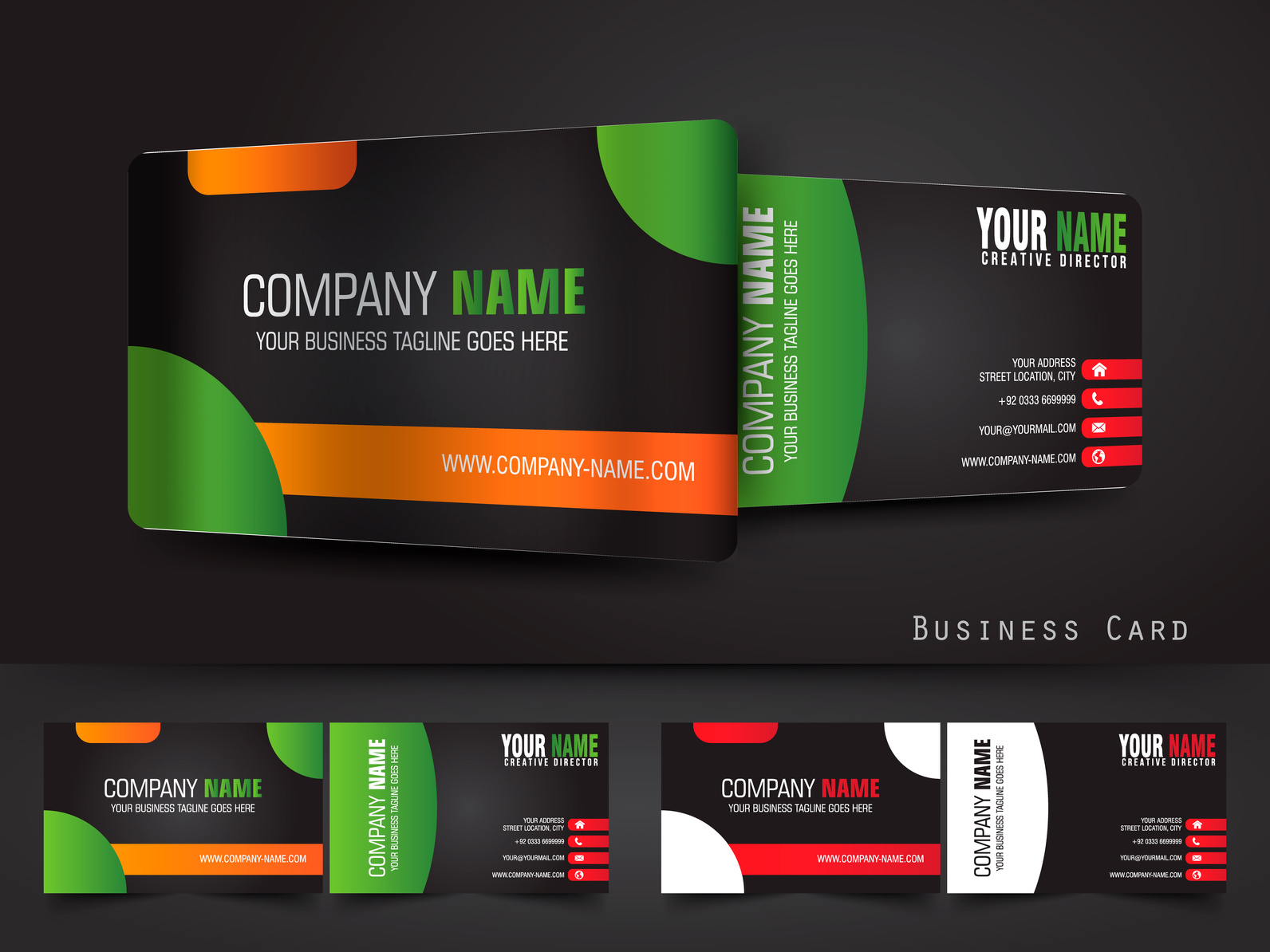
 Though many business transactions have gone digital, there is still one element that remains tangible and personal — the business card.
In companies around the world, employees exchange these tokens to introduce themselves, share contact information and leave a lasting impression.
They come in many shapes, sizes, materials, and formats, but they’re all designed with the same intent — to get you noticed.
As such, a dynamic business card design is critical to ensuring others remember you and what you represent.
Today, we’re going over a few tips to help you make sure your design is eye-catching, interesting, and memorable.
Ready to get started? Let’s go!
1. Keep the Format Clean
It can be tempting to squeeze as much as you can into the small space. Yet, a successful business card design is one that gets the message across as neatly and orderly as possible.
The average person’s attention span is now around eight seconds — shorter than a goldfish’s. That means you may only have a small window of time before they file your card away or lose it in their desk or wallet.
Clean formatting can help make sure they absorb your card’s content.
This means keeping copy a comfortable space from the edge (around 5 millimeters should do it), keeping font neat and legible, and using high-quality images that don’t distract from your message.
2. Don’t Bury the Lead
Remember, the most important role of a business card is to help people remember you and to help them reach you.
As such, make sure the most important part of your information is easy to spot. People shouldn’t have to guess what you do or who you work for after they read your card.
For example, if you run a bakery, the word “bakery” should appear somewhere on your card. The same goes for every professional, from mechanics to restaurateurs and CEOs.
Any business documentation, from sales quote templates to meeting minutes, begin with a title that clearly expresses the data to follow. The same rule applies for business cards — start with a bold introduction.
3. Impress with Visuals
Studies show that our brains process visuals 60,000 times faster than text.
So don’t be afraid to get creative with the images on your card, given that they support your brand.
Some employees may use an entire side of the card for a single image. Others may opt for a more minimalist approach and simply center their company logo.
It might cost a little more to print a two-sided card, but this can be valuable real estate when it comes to making a first impression.
4. Think Outside the Box, but Inside the Wallet
There are myriad different materials you can use to create your business card.
Today, companies are getting imaginative, trying everything from wood to plastic, to give their cards a special feel.
They’re also experimenting with different layouts, with many opting for a vertical layout over the traditional horizontal one, using the extra space to elaborate on their business offerings.
While these are all exciting and interesting options, it’s important to keep your target audience in mind when going this route.
Though some may appreciate an unusual business card design, the reality is that most of them will stick your card in either their wallets or business card holders.
To this end, if your card is designed in such a way that it won’t fit in those spaces, it might get tossed.
Often, it’s easier (and more economical) to stick to tradition. Around 2″ by 3.5″ is the standard. Remember, you want to stand out — but for all the right reasons.
Ace Your Business Card Design: The Tools You Need
Are you ready to create or revamp your business card? If so, we’d love to help you develop a design that’s bold, creative — and entirely you.
We provide resources that help you understand and utilize computer graphics to create images that stand out from the rest.
From design and interface advice to graphic design tips, we share it all, helping you take that next step with confidence. Check us out today!


