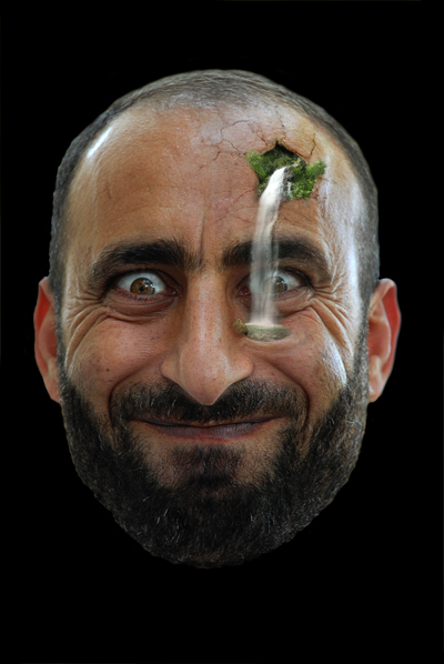
This is part 1 of a set of tutorials here on PSD learning which will take you through the process of changing a head into a garden. This part will show you some great photo manipulation techniques which will create a waterfall coming out of the mans head. This will explore important manipulation techniques like masking, composition and color adjustments.
Tutorial Files
If you are a PSD PRO member then download the PSD file and much more by going here.
Introduction
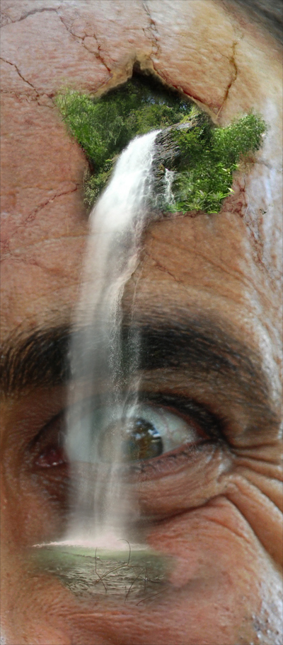
This is part 1 of a set of tutorials I am writing, which will basically take you through the process of converting a man’s head into a garden. The first part will be showing you how to prepare the image then add a waterfall coming out of his head with a pool at the bottom, like the image below. All the tutorials in this set will be fairly advanced but worth giving a go, they will also require you to work rather than just match up layer styles and settings. You are guaranteed to learn a bit no matter what level you are at and you will see what Photoshop is capable of producing when you have a bit of imagination.

Step 1
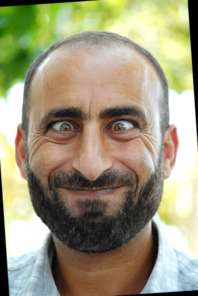
Start by copying this image (Original image from: http://www.sxc.hu/browse.phtml?f=view&id=941938) then create a new document, this should size to the dimensions of the image we copied. Using the paint bucket tool, fill the background layer in black. Next paste the image in then rotate the face slightly to get it it straight. You can use some guides here and match them up with the nose in order to help you.
Step 2
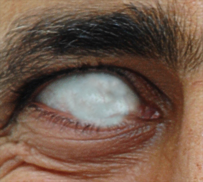
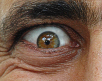
Now we want to straighten up his eyes a bit so first first we need to get rid rid of the original pupil and iris. Create a new layer then select the clone stamp tool and in the main toolbar change sample to ‘all layers’ this will mean that we can clone part of the image but add it to a new layer, this is often the most useful way to use the clone stamp tool. Here I used a soft brush about half the size of the eye, and had it set on 50% opacity. I had to go over it a few times to get it looking good, if your eye is looking a bit blurry after this then clone some of the veins into the middle of the eye and maybe raise the opacity for this. Don’t put too much time into this as most of the parts will be covered by the new pupil we will be adding in. At this point, feel free to go over the edges of the eye as I have done in the image below. Not that at this point we are only working his right eye.
Step 3
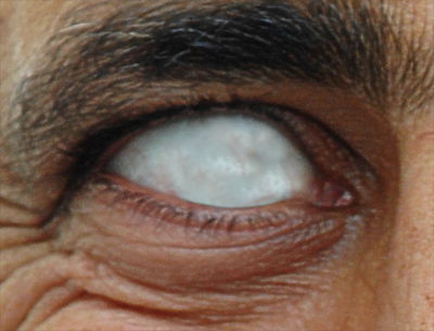
Now to get rid of the parts which cross the boundaries of the eye; in the layers panel, press the new layer mask button to add a layer mask to this layer. Next select a black brush with about 80% hardness and roughly the same size as the brush we used in the previous step, also make sure this is set at 100% opacity. Just brush on the layer mask, over the parts which you want hidden. This can also be done by using the pen tool then making a selection from the path, this will give a better curve but since the part that we are working on is so small then the brush should be sufficient for this task.
Step 4
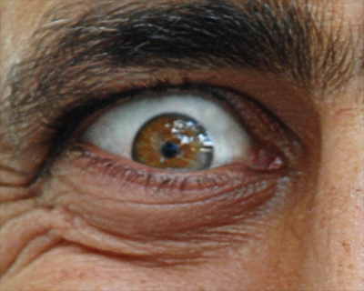
Okay select the layer with the face in it then duplicate it and drag it to the top of the layer stack. What you want to do now is to hold alt and click on the layer mask button; this is a quick way of creating a ‘hide all’ layer mask. Now hide the layer with the white part that you cloned on it then select the brush tool and choose a white 80% hardness brush. What you need to do is match the size of the brush up to the size of the iris, use the ‘[‘ and ‘]’ keys to make it easier. Another tip is when the brush is selected, instead of always going up to the main toolbar to change the settings, just right click in the document and the dialog box should pop up. Once you have the brush matching the size of the iris, select the black layer mask that we just made then click on the eye, it should look like nothing has happened but if you move this layer then you should see the iris move as well. So move this new one to the middle of the eye and unhide the layer with the white part on it.
Step 5
Now you’ll notice part of it will be outside the eye now so use the same technique as in step 2 to mask this off, obviously you’ve already got a layer mask so you don’t need to add a new one. After you’ve finished with this eye then put these two layers in a new group called ‘right eye’.
Step 6
You now need to do exactly the same with the other eye then if you want you can put both of these in a new group called ‘eyes’ just to keep it neat.

Step 7
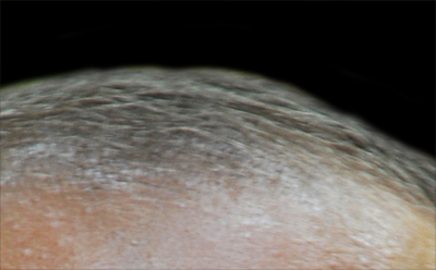
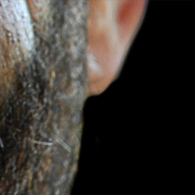
Right the next thing I did was to mask out the whole face to hide the background, this is optional but I decided to to do it now even though we won’t be adding a background until a later tutorial. Since this isn’t a masking tutorial I will provide the mask that I used here although you may have to rotate it slightly to match your image. It is probably better to learn the hard way so if you are masking it yourself then first add a layer mask to the face then use a black brush with around 80% hardness and 100% opacity. You will have to constantly change the size of this brush and also probably the hardness. Below are a couple of images to show what my mask looked like.
Step 8
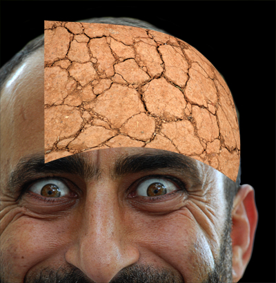
Now we are going to add the crack to his head so I used a picture of dry, cracked mud which can be found here. All I did to get it to this stage was to scale it then I went edit>transform>warp to match to shape of his head. Use the final image at the top to see what part of these cracks we will actually use, you will notice that only the right and middle part of this image actually matches the head, this is because the top, left and bottom won’t be needed.
Step 9
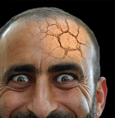
Next add a layer mask to this image then select a large, 0% hardness, black brush and erase the edges using an appropriate opacity. Next lower the opacity slightly in order to blend it in more. Keep working at it until you end up with something that resembles the image below.
Step 10
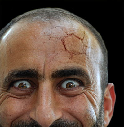
Now change the blending mode of this layer to overlay, this means that the it will darken the face in the areas that are dark on the crack image and lighten the areas that are light. You will now notice that the color is a bit off and also the cracks are a bit bright. When using image in this way, almost everything can be fixed using both a hue/saturation and a brightness/contrast adjustment layer. First add a hue/saturation adjustment layer then click okay without changing anything. Now hold alt and click between the adjustment layer and the crack layer to add a clipping mask, this means that the hue/saturation will now only affect the cracks. Double click on the hue/saturation layer and you can now alter the settings and see the cracks changing at the same time. What I did was to change it to grayscale by moving the saturation to -100 then I also moved the lightness to -12. Next add a brightness/contrast layer and do the clipping mask thing between this and the hue/saturation layer. Then change the brightness and contrast both to -50. The crack should now look a lot more realistic but feel free to change some of these settings. Lastly create a layer group called crack and drag the layer and the two adjustments into it at the same time. I usually work in this way where I create an element in quite a disorganized way then arrange it into groups afterward so as not to break up my creative flow.
Step 11
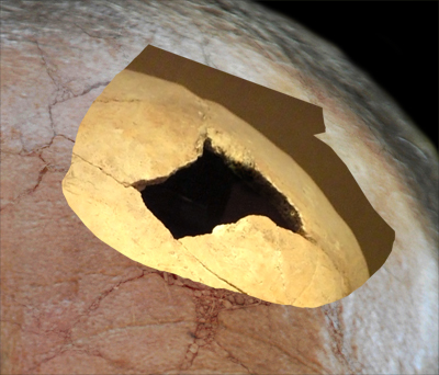
Now we are going to add the hole in his head, at first I was going to just fill this black or a dark color but I decided to try and make it more realistic by making part of his skull visible. However this is hardly visible in the final image but I do think it adds more depth to the image. Start by copying and pasting this image into your document. Next go edit>transform>flip horizontal because we want it on the right of our image. Now we want to isolate only the crack; you could use a layer mask but there really isn’t any point because we know exactly what part of this image we want, the way do this is just to grab the lasso tool and roughly draw round it then go select>inverse to invert this selection then just hit delete. Now move this roughly over the crack like shown in the image below.
Step 12
Add a layer mask this layer then what you want to do is mask it so it is roughly inside the crack, use the image below as a reference. You will have to vary the brush opacity, size and hardness to get it right. One thing that I often do is what I call ‘stroke masking’, to do this add a stroke to this layer using the fx button in the layers panel then for this maybe just change it to about 1px. Now you should have a red line round this layer, so if you now change the fill opacity to 0 or something very low, you can still see the stroke but not the skull. This means that you can now mask it until the stroke matches the cracks while being able to see the cracks.
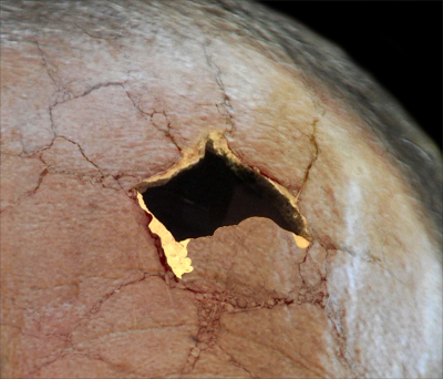
Step 13
Now create a new layer and select a black brush and paint in the rest of the cracks until it looks like the image below. That’s all there is to it.
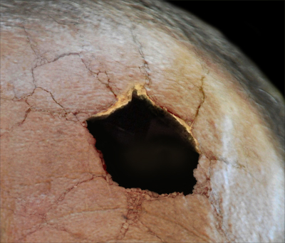
Step 14
Next I created a brightness/contrast adjustment layer and changed both to their minimum values. Obviously this changed the whole image so we could either apply a clipping mask or a layer mask; I tried both and found the layer mask way was more versatile and gave a better result. So alt click on the layer mask button to add a black mask then get a whit brush and brush over the skull parts to darken them slightly.

Step 15
This isn’t much of a step so I’ll make it more of a recap, but first create a layer group called ‘hole’ and place these three layers inside it just to tidy things up. Okay for this hole so far we’ve, instead of aiming straight for creating the hole we broke it up into small chunks, which I like too think of as problems, then solved them one at a time. I always find that with this kind of manipulation you always have to build up in a logical manner and works better if each element is built up from another element so here we had the cracks then used the shape of the cracks to build the skull then the hole. Sometimes the hardest part is is working out how to tackle the problems rather than actually doing it and I often spend a significant bit of time working out the way the way Photoshop will handle it. For example you may immediately think that cracks like this would come from making a hole like this and would aim to add cracks round the hole, but since we’re not in the real world here we have to work out the best way of doing it in Photoshop. Below I’ve included an image of what mine looked like up to this point.
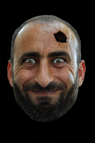
Step 16
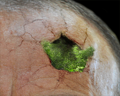
Next I added the plants in his head so I had something to build the waterfall upon. You can really use any image with plants in it for this, the one I used can be found here. Use the same technique as we used for the skull to cut out part of the image, this makes it a lot easier to use the free transform tool as we are not working with a massive image. Place it above the hole and if you feel like scaling it, flipping it or rotating it then do that.
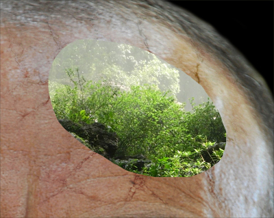
Step 17
Now we want to achieve a result like the image below, I have a great technique for working with plants which can add lots of depth to plant even if you are only using one image like we are. First you want to add a layer mask then get rid of all the hard edges then mask round parts of hole, for me this was mainly the bottom right and left then use a lower opacity brush fade some parts that are going to be in distance; this was the top middle part. Now for the technique I mentioned, for this you will need some tree brushes; a really brilliant brush set which I use probably more than any other brush set I’ve downloaded is the tree brushes found here, I’ll say now that I think I’ve only once used these to create trees, as they are a lot more useful for masking. So select one of these brushes and use it to mask this plant by varying the opacity and also using it in white at times. This makes masking trees a lot easier as you don’t need to be accurate because you will always receive a tree like edge. When using these brushes you have to roughly match up the sizes of the leaves.
Step 18
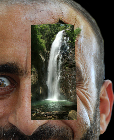
Now we are going to add the waterfall at last; ironically this was probably the easiest part and only took me about two minutes to finish putting in the waterfall. First copy this image then paste it into your document, resize it then flip it horizontally.
Step 19
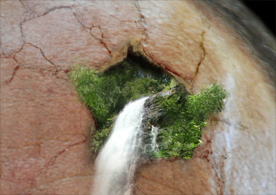
First we are going to work on the part at the hole, this is quite easy as the plants in the waterfall image and the plants we added match perfectly. So add a layer mask then get a low opacity black brush and keep brushing until you end up with something like the image below. Do this by subtly blending it and also use the tree brushes if you want. Ignore the water at the moment.
Step 20
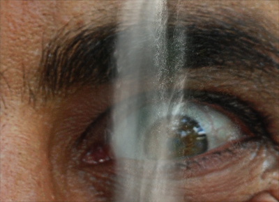
The water wasn’t too hard either, first I used a high opacity soft brush to get rid of the rocks and tried to get as close to the water as possible. To make the face show through behind I used a large, low opacity brush and brushed repeatedly up and down the waterfall. Take a bit of time on this part as it will affect the final image a lot.
Step 21
The pool was a bit annoying because I didn’t quite know what to do with it so for this part just use a soft brush to achieve something like the image below and we will work on that part next.
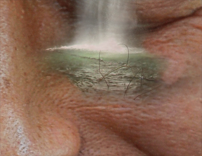
Step 22
Now just put this and the plant layer in a new group called ‘waterfall’. Below I’ve included a large image showing the whole waterfall that you can use for reference.
Step 23
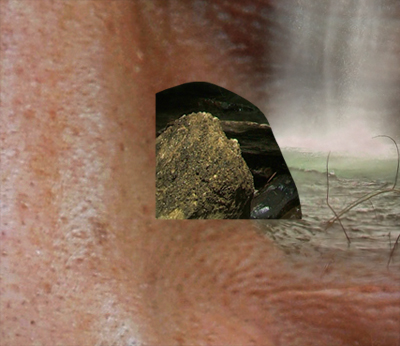
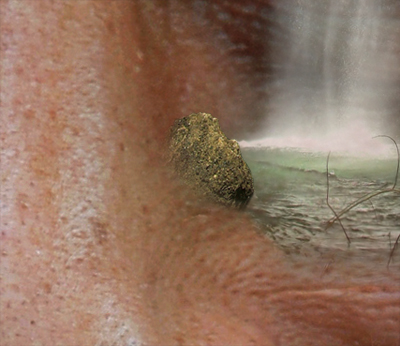
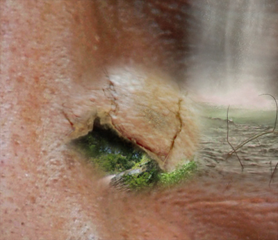
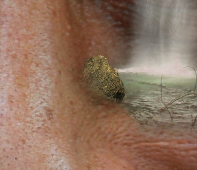
I now needed something to block the water so my first idea was a rock that looked like a skin defect on the nose. I’ll be a bit more vague here as we have covered all the techniques for this already. You might recognize the rock I used here because it came from the same waterfall picture so paste it in again then scale and cut it out roughly to look like the first image then mask it to look like the second.
Step 24
create a new layer then use the clone stamp tool in the same way as we did the eyes just by selecting the target by alt clicking then draw the part you want overe the rock. You will notice that I used part of the hole, this was because I wanted the crack. I scaled it then rotated it to look like the first image. Next I masked out everything except the main crack then changed the layer opacity to 50% and the blend mode to multiply.
Step 25
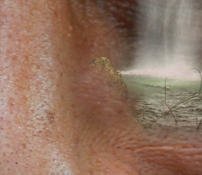
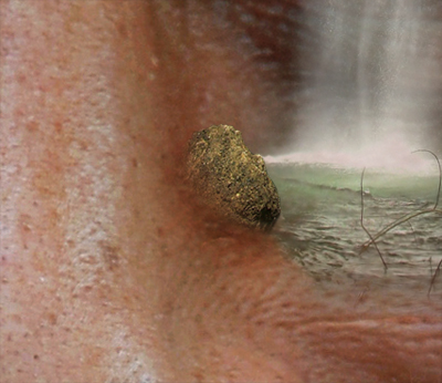
I used the clone stamp tool again to copy a piece of skin onto a new layer using a soft brush. This gave me a result like shown in the first image, I then changed the blend mode to overlay and the layer opacity to 70% to achieve the final result shown in the second image. Again put these three layers in a new group named ‘rock’.
Step 26
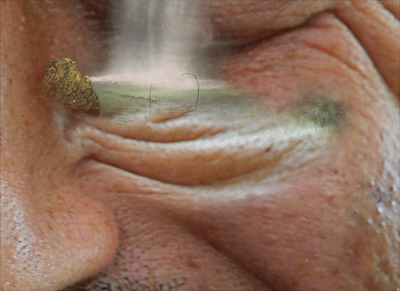
Here I decided to warp the face so that it looked like there was a small hole that the water could sit in, this was probably one of most challenging parts of this image because when working with skin, everything has to look perfect or else it will stand out a lot. First I created a new layer then used the clone stamp tool to copy some of the wrinkles from just above his left cheek. I rotated them then used the warp tool to curve it slightly. Use the image below as a guide.
Step 27
Now add a layer mask to this and then there’s nothing more to it than just brushing until its looking good, also brush over the main part with a low opacity brush at parts in order to blend it into the skin behind.

Step 28
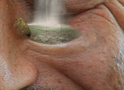
Next I cloned some normal skin over the right of this wrinkle to extend it and also to blend it into the rest of the face. This obviously had a layer mask and I spent a bit of time working to get this looking normal. Check the image to see what mine looked like.
Step 29
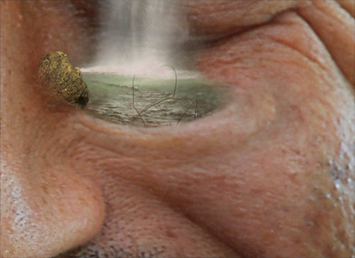
You will notice that the highlights on this wrinkle don’t match the lighting at all, to change this I simply used the eyedropper to select a rough skin color then used a soft low opacity brush on a new layer and painted over these highlights. I then added a layer mask to refine this.
Conclusion
Hopefully you learned something from this tutorial and also achieved a good result. To properly learn these techniques it is often useful to try doing the same thing on another image, maybe your own face to practice. Check back or subscribe if you want to catch part 2 of this tutorial which should follow on nicely from this one.
