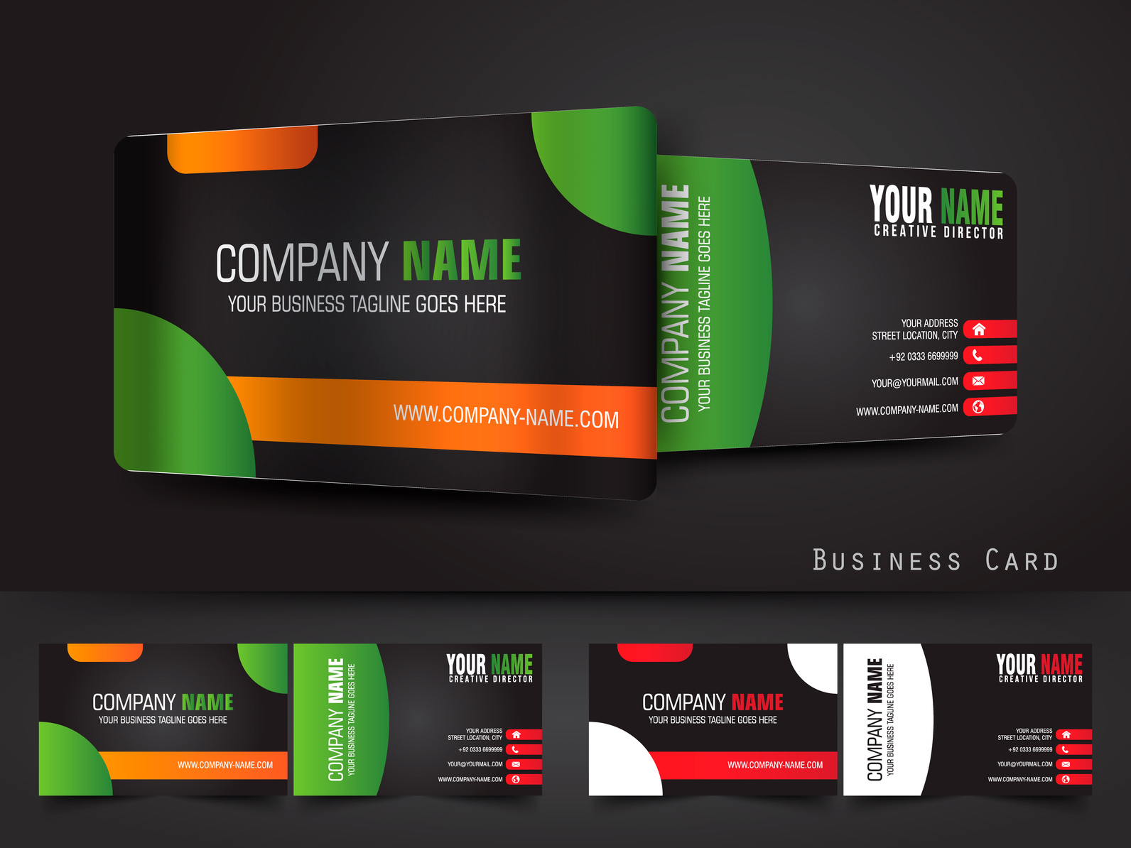
Using visuals the right way is key to having a great brand. So how can you use graphic elements for your own corporate identity branding?
Think of a brand you come back to again and again. You can probably picture their logo, store design, or color scheme right away. This means they have great visual branding!
You can have all the written and personal elements of branding down, from company culture to carefully crafted website text. However, without great graphics, your corporate identity will never be complete.
That identity is crucial for companies that rely on trust, such as financial companies. We’ll walk you through how to use graphics to build that identity branding and ultimately gain the trust of your customers.
3 Ways to Use Graphics in Your Corporate Identity Branding
1. Get a Great Logo
We may not consciously think about logos often, but the logos of your favorite brands are probably saved somewhere in your brain. Just think of two or three brands you love. The logos are easy to picture, aren’t they?
A good logo is memorable and compelling. When a customer sees the logo of a brand or business they’ve had a positive experience with, it’s easy for them to make the decision to use that brand again. The logo motivates them, even if they don’t realize it.
How you design that logo is up to you. It may be strictly visual, or it might have your company’s name or initials incorporated. It might even be just the name with perfectly designed font and formatting, or the name plus a small symbol.
A simple, memorable logo is best. Don’t make it too busy. Remember, this logo is what you’ll want customers to associate with your business from now on, so make your logo clear and easy to recognize.
2. Choose the Right Colors
Once you have your logo set, any colors can be chosen. But colors are almost as important as the design itself. How strange would it be if the Pepsi logo was green and yellow?
Think about what sort of feeling you want your business to inspire in customers, and choose your colors accordingly. Green signifies fresh, or natural, which is great for marketing to an eco-friendly crowd. Blue seems steady and trustworthy, which can make customers feel more comfortable taking out emergency business loans or making other big financial decisions.
Remember, colors aren’t just for logos. They are a part of overall branding. Anything from website design to employee badges should reflect the company colors you choose – it’s all part of the graphic side of your corporate identity.
3. Pay Attention to Typography
If you’ve never heard of kerning, you’ll want to start thinking about it now. Kerning is the science behind how letters are positioned in a font and how much space is between each one. Logos without kerning tend to look unprofessional.
Small considerations like this, as well as major things like font, are part of typography. They’re extremely important to the overall look and feel of your branding.
Time to Get Graphic
Without the graphic element, branding as we know it wouldn’t exist.
Take the time to get the graphic side of your corporate identity branding right, and you’ll see the difference in how many customers you attract and keep.
Don’t sleep on all the positive benefits of visual branding. Get graphic today – start designing your visual branding now!


