
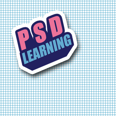
This will show you how to create that slapped on sticker effect I’m sure you’ve seen popping up around the internet. Its simple to make but looks really good in pieces of art and also on webpages for example as an image link to an RSS feed. Read on to discover how to create these in only a few steps and learn a really easy way to achieve a 3D text effect at the same time.
Tutorial Files
If you are a PSD PRO member then download the PSD file and much more by going here.
Introduction
This sticker effect looks great when slapped on web pages, I’m sure you’ve noticed them for RSS feeds or post comments or something along those lines. Well the effect is simple to make and worth learning. I’d definitely recommend downloading the PSD file for this tutorial from the tutorial files page as It will come in handy especially in the last few steps just to refer to and is probably the best way of learning Photoshop. I’d also like to see how creative you can get with these stickers so upload your image at the end of the tutorial.

Step 1
Start by creating a new document with dimensions; 10x10px. Now we want a grid to show so go Edit>Preferences>Grid… and set it to a gridline every 5px and 1 subdivision. Make sure the grid is showing, if its not then hit Ctrl+’. To make the next step even easier we will turn the snap on by going View>Snap.
Step 2
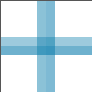
Select a blue color, something like #0b7dac should work well then select the line tool and make sure in the main toolbar that the fill pixels button is active, the weight is set to 1px and that anti-alias is checked. Now just draw a vertical line then a horizontal one so that the image looks like the one below. Go Edit>Define Pattern and save the pattern then close this document.
Step 3
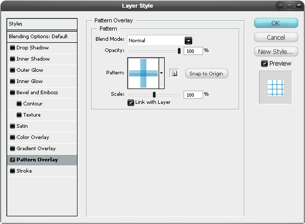
Create a new document with dimensions; 500x500px then create a new layer then hit D to reset the colors then hit Ctrl+backspace to fill the layer white. Right click on this layer and select blending options and add a pattern overlay using the settings shown below.
Step 4
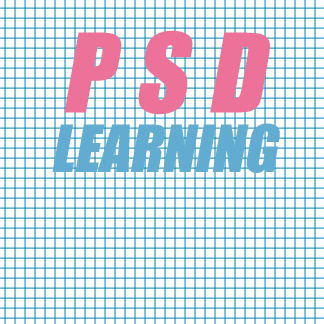
Select the text tool and type some text, if you go Window>Character you will open up the character editor which will give you more control over the text. I used Impact regular italic as the font and also adjusted the tracking (horizontal spacing of characters) and the leading (vertical spacing between lines). You can now change the color of the text; for ‘PSD’ I used #ec7299 and for ‘LEARNING’ I used #62acd1 but feel free to experiment.
Step 5
Go into the blending options for the text layer and add a stroke with the settings shown below, using a dark blue as the color.
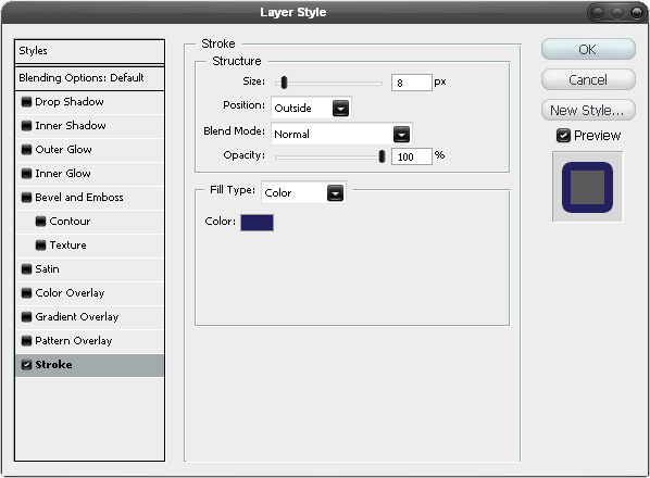
Step 6
We now want to make this look 3D, there are a few ways to this but most of them them would just overcomplicate this as we don’t need it too accurate. So firstly, create a new layer and choose a vanishing point which in mine I marked with a simple black dot. If the vanishing point is below the text it will give the appearance that we are looking up at it, if its above it will seem that we are looking down at it and the same rule applies for putting the vanishing point at the left or right. Things tend to stand out better and look bigger if we put the vanishing point below the object like I have done here. Next I selected the line tool and starting at the vanishing point I drew lines extending up to any outside edges that made a tangent. If you’ve done any technical drawing or graffiti art then this should be quite easy. Study the image below if you don’t know what I’m talking about.
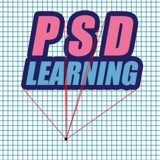
Step 7
Create a new layer then move it below the text layer and make sure the foreground color is the same color as we used for the stroke. Select the polygonal lasso tool and make selections within the perspective lines then hit Alt+backspace to fill them with the dark blue color and do this for all the lines. If you did it correctly it should give the same effect as shown below.
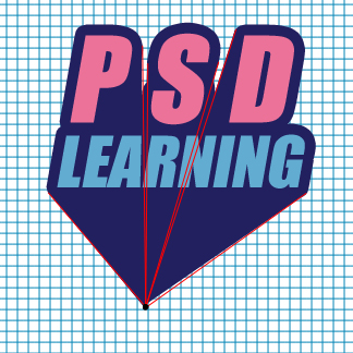
Step 8
We want to get rid of part of the bit at the bottom so using the polygonal lasso tool again make a selection around the bit you want to get rid of then hit delete. You could also use a layer mask here if you think you might want to go back and change something. You can also delete all the perspective lines.
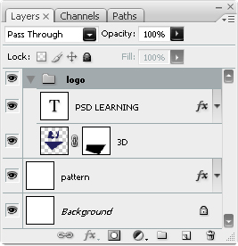
Step 9
Below I’ve shown what my layer panel looked like at this point so try and arrange your layers to look similar to this and make sure that the text layer and the 3D bits are within a layer group. Now right click on the layer group and if there is an option saying ‘Convert to Smart Object’ then click it, if not then go back and left click on the layer group and hit Ctrl+E to merge the group.
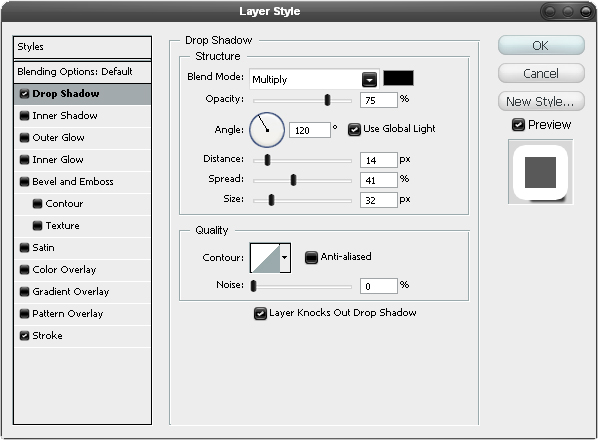
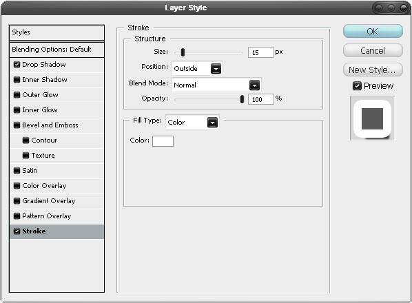
Step 10
Right click on the merged layer or smart object then go to blending options and add a drop shadow and a stroke with the settings shown below.
Step 11
Now hit Ctrl+T to enter free transform mode then move and scale this layer like shown in the image below.
Step 12
You can now add some extra things to your image; I’l breifly describe what I did. I flattened the pattern layer and added a displace filter using clouds as the map, if you don’t know much about the displace filter, I wrote another tutorial using it here. I also made a clouds layer above the pttern layer and set it to overlay. I used a splatter brush for just behind the sticker. I then used the brush tool with a 3px brush to give the effect of a biro pen.


