
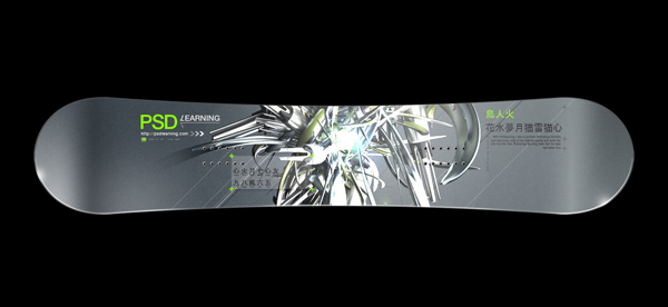
Yesterday I wrote a tutorial on creating a Snowboarding poster design, so today I’m carrying on that theme and showing you how to design a snowboard deck. We’re going to start with a template then use tech styles and 3D renders to make a design that really stands out. If you’re into snowboarding you can even make this into a full size design and get it printed.
Tutorial Files
If you are a PSD PRO member then download the PSD file and much more by going here.
Introduction
A lot of Photoshop tutorials around the web show you how to start with nothing and end up with something but if you want to start really designing, you’ve get to learn how to use good resources, like textures, brushes and renders. Today we’re going to be doing just that through creating a snowboard deck, the inspiration for this tutorial came from Aeriform, a design company with a very impressive portfolio; check it out! We’re going to need a snowboard template, so download this template made by Nuno Lopes; a great digital artist. Secondly we need an abstract 3D render so download this pack, made by K3 Studio. Lastly we need a Chinese font, this is optional though, I used this one so download and install it. Sorry for making you download a few things but trust me its worth it, you’ll end up using more than once, a good idea is to have a resource folder on your computer where you can put all these resources and organize them into different folders like brushes, renders etc. Anyway lets get going!
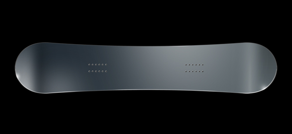
Step 1
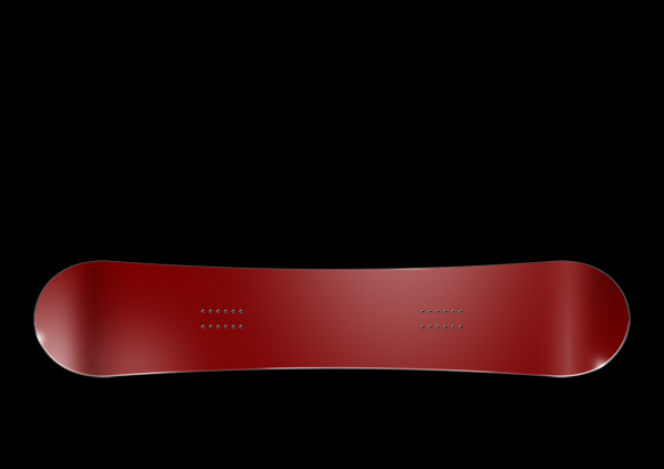
Open the snowboard template in Photoshop, now we are going to have to resize it for various reasons but if you’re planning on making a full size snowboard design then the best idea would be to follow the tutorial in the same way to get a good idea of how its done then go back through and do it without resizing it. First go Image>Image Size and change the width to 1000px making sure constrain proportions is checked. Then go Image>Rotate Canvas>90° CW, next because I’m fussy and I didn’t like the highlights like this I went Image>Rotate Canvas>Flip Canvas Vertical. We’re only going to use the top side of the deck in this tutorial so select both the ‘(down)’ layers, the text layer and the ‘brightness/sharpness 2’ group and delete them so you are left with something similar to the image shown below.
Step 2
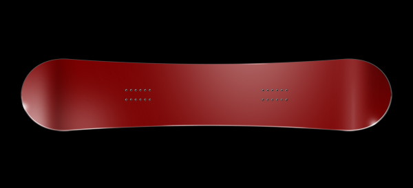
Now grab the crop tool and crop the height of the image, just keep the width the same, this is to remove the empty space where the other board was.
Step 3
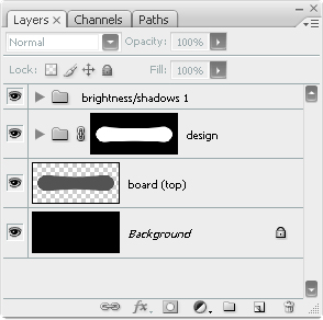
This might seem a slightly unnecessary step but it will make designing the board much easier, first create a new layer group above the layer called ‘your design’ (red board), do this by clicking the folder icon in the layers panel. Now rename the group as ‘design’ then Ctrl+click on the ‘your design’ layer to make a selection around it then select the design group and press the layer mask button in the layers panel (next to fx). This will create a mask on this group meaning that everything that we put within this group will not extend outwith the snowboard shape, you can now delete the original ‘your design’ layer. Your layers panel should now look the same as the one shown below. From now on we will put everything inside this group so when I say to create a new layer, you create it inside the group.
Step 4
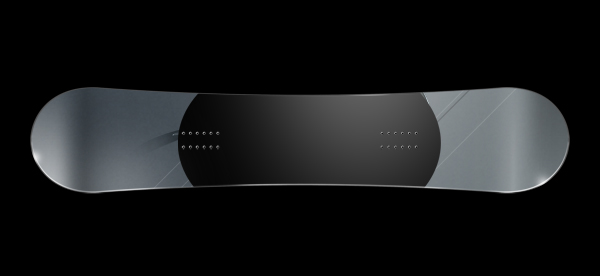
Create a new layer for the background color then select the gradient tool and make yourself a gradient similar to the one below, try and get the colors roughly matching; you can always change the hue later on.
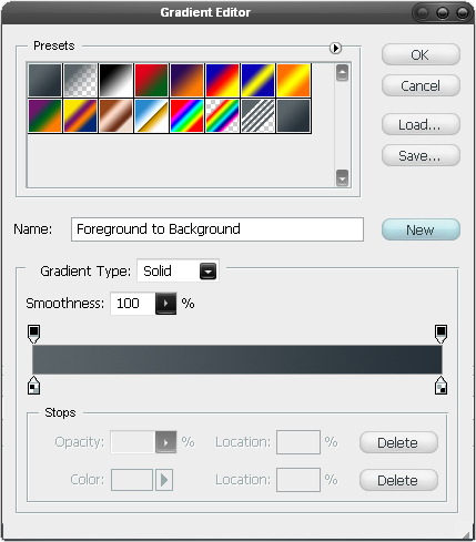
Step 5
Using either a linear or a radial gradient drag from right to left so you have something similar to the image shown below.
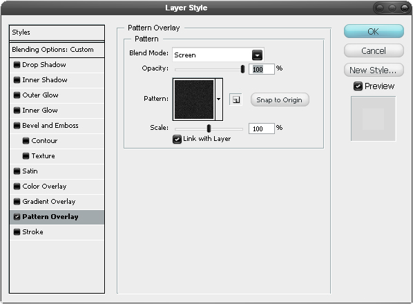
Step 6
We are going to add the effect of a texture to the design now, we do this by using a pattern, if you have some patterns that you really love then feel free to use one of them, if not then I found a great one (can’t remember where) that looks a bit like rubber. So first download this image and open it in Photoshop then hit Ctrl+A then go Edit>Define Pattern and save the pattern then close that document and go back to your snowboard. Create a new layer then hit Alt+Backspace, this will fill the layer with the foreground color but it doesn’t matter at all what this is, in the layers panel change the fill opacity to 0% then right click on the layer and go to blending options then add a pattern overlay, selecting thee pattern you just made, use the settings shown below.
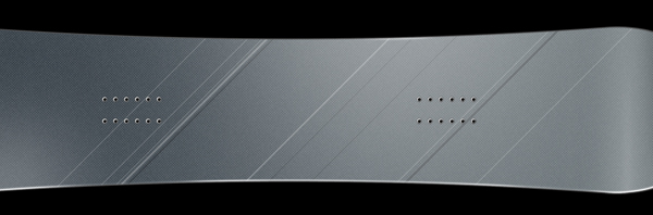
Step 7
We’re now going to add some smart looking lines so first create a new layer and set the opacity of the layer to 25% then select the line shape tool then set the foreground color to white and the line’s weight to 2px, in the main toolbar make sure the ‘fill pixels’ button is pressed. Now hold shift and draw a couple of 45° line, don’t worry about going outwith the snowboard as our mask hides this anyway, next create a few more lines at 1px and 3px weight then change the foreground color to black and create some more 45° lines at these weights. Do this until you have something that resembles the image below.
Step 8
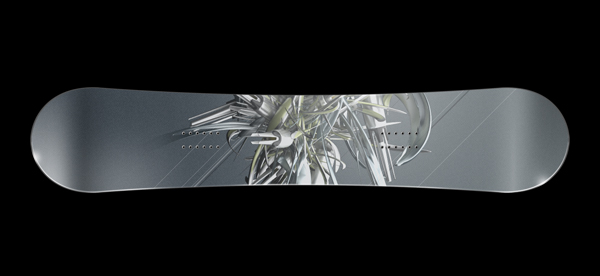
We are going to add our render in now so open the file named ‘Jotunheim’ from the pack that I mentioned in the introduction. Ctrl+click on the layer in this file then hit Ctrl+C to copy the image, you can close this file now and go back to your snowboard document. Now just hit Ctrl+V to paste this in then make sure this layer is placed directly above the lines layer and is positioned similarly to in the image below. Change the opacity of this layer to 75%, you’ll notice that at the left lide I’ve blended part of the render into the background; you don’t need to do this but if you want to then just use a soft erasor set at about 20%.
Step 9
Duplicate this layer then change the blend mode to overlay.
Step 10
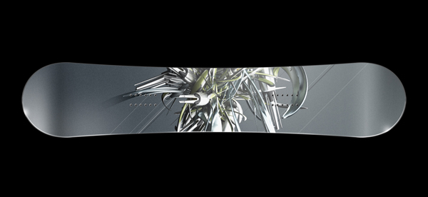
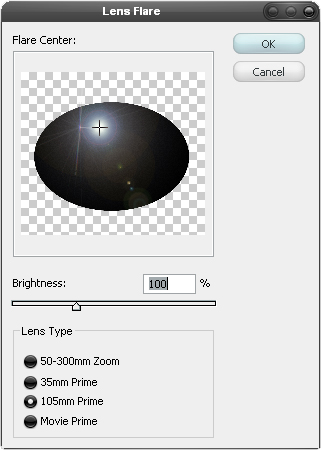
We need to add some lighting to the render so we’re going to use the lense flare filter, this filter (and most others) usually looks really naff when you can tell it has been used but her it will blen in pretty well. First create a new layer then select the elipse shape tool and, with the foreground color set at black, draw an elipse like the one in the image below.
Step 11
Now go Filter>Render>Lens Flare and use the settings shown below, note that you want the lens flare to be in the center of the render.
Step 12
Now to make it look good just change the blend mode of this layer to color dodge and you’ve got some awesome lighting right there.
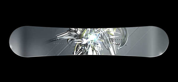
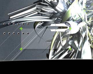
Step 13
Select a bright green (or any other color if you don’t like green) as the foreground color then select the line tool and change the weight to 2px, create a new layer and draw a small cross like in the image below; zoom in (or use the grid) to get it accurate.
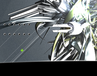
Step 14
Duplicate this layer then move it up slightly then duplicate both and move them to the right, so you have four crosses like four points of a rectangle.
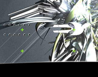
Step 15
Select the rectangle tool and change the foreground color to white then draw a box in a new layer so you have a cross at each corner of the rectangle.
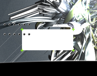
Step 16
Go into the blending options for this layer and add a drop shadow and just keep the default settings. Then change the opacity of the layer to 20%.
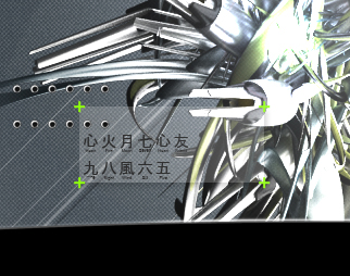
Step 17
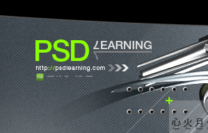
Select the text tool and use it to add some random text then go Window>Character to open the character editor, highlight the text then change the font to your Chinese font, change the color to a dark gray then just alter things like the size and the tracking (horizontal character spacing); I had to decrease the tracking a lot like -200. You should end up with something similar to in the image below.
Step 18
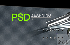
We’re going to add the logo/branding/name etc. most of you won’t be wanting to make a PSDlearning themed board so I can’t really tell you what to do so I’ll just explain what I did, make sure you create each element in a new layer though. Here I used Helvetica and typed PSD in green then I typed a 7 and rotated it 180° then typed ‘earning’ to make it looked like ‘learning’, I then used a horizontally flipped 7 and a 2px line to create the bit under ‘learning. If you’re sensible then you might have already created a layer group to put all this logo stuff in, if not then it’s definitely a good idea.
Step 19
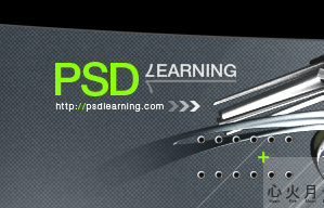
I then typed the URL of PSDlearning and changed the color of the two slashes, next I used the custom shape tool to create these three arrows which I set at 30%, 60% and 90% opacity.
Step 20
Lastly I added a tiny PSDlearning log and some random white dots next to it and that was me finished. Creating techie typography branding like this is quite tricky so don’t worry if your’s doesn’t look great because it isn’t easy to get it looking balanced – keep at it though!
Step 21
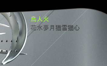
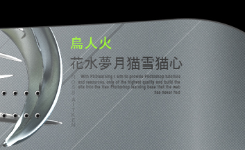
I wanted to add some more typography at the other side so do a similar thing, here I added some more Chinese text in green and gray but then removed the English text that was below it; you can do this with either a layer mask or by rasterizing the type then using the eraser tool but then again you might like the text below it.
Step 22
I then added my name going vertically by using the text direction button in the main toolbar. I added some really small text that is right aligned, You can basically type anything here as it isn’t going to be readable unless you go on to create a full size version.
Step 23
Lastly I put in some more of the crosses only this time in gray, feel free to add some of your own ideas as well.
Conclusion
There we go, a professional standard design in only 23 easy steps, one last thing you can do is to add a hue/saturation adjustment layer at the top of the layer stack then play with the hue to get different colors. Hopefully you’ve learned something new from this tutorial, spread the work and check back for more quality Photoshop tutorials.


